Apple’s recent iOS 26 update introduces one of the biggest visual redesigns in years. While many users appreciate the modern and futuristic appearance, others have reported discomfort after upgrading. Across forums and social media platforms, some users have shared experiences of dizziness, nausea, motion sensitivity, and eye strain while using the new interface.So, is Apple’s new design a breakthrough in user experience, or could it be causing unintended usability issues for some users? Let’s take a closer look at the new iOS 26 Liquid Glass UI and what it means for iPhone users.
What Is Liquid Glass UI?
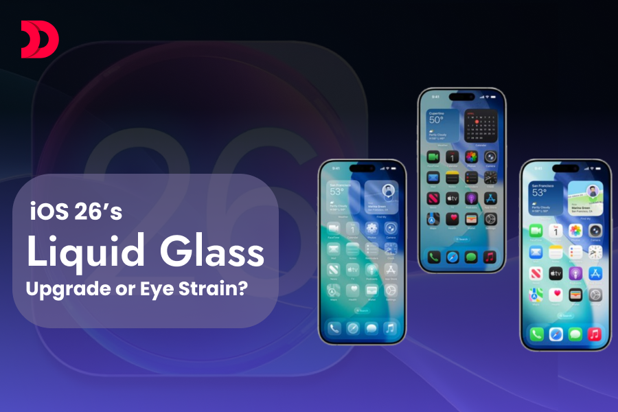
One of the most noticeable visual changes introduced with iOS 26 is the new Liquid Glass UI. Inspired by the appearance of real glass, the design adds transparency, reflections, depth effects, soft glows, and subtle motion throughout the interface.Icons appear more dynamic, menus feel layered, and interface elements seem to float above the screen. The effect becomes even more noticeable in Dark Mode, where reflective highlights and transparency create a stronger visual impact.The design direction also reflects Apple’s broader push toward immersive digital experiences and spatial computing. Similar visual concepts can be seen in Apple’s Vision Pro ecosystem, where depth and layered interfaces play a key role in the user experience.
Why Apple Introduced Liquid Glass UI
Apple’s goal with Liquid Glass appears to be creating a more modern, immersive, and visually engaging experience. Rather than relying on flat design principles, the company is introducing greater depth, motion, and realism across the operating system.The new design language aligns with Apple’s growing investment in spatial interfaces and next-generation user experiences. As technology evolves, visual elements are becoming more interactive and responsive, helping users feel more connected to the digital environment.For developers building custom iPhone applications, these changes also influence modern iPhone application development trends and user interface expectations.
What Are Users Experiencing Since the Update?
Since the rollout of iOS 26, users have taken to online communities and social media platforms to discuss various symptoms they believe may be related to the new interface.Some of the most commonly reported issues include:
Dizziness
Eye strain
Motion sickness
Visual fatigue
Headaches
Vertigo-like sensations
These experiences appear to be more common among users who enable Dark Mode, use dark wallpapers, or spend long periods interacting with the interface.It’s important to note that these are user-reported experiences and not officially confirmed side effects by Apple.
Why Some Users May Feel Dizzy
Not every user experiences discomfort when using iOS 26. However, individuals who are sensitive to motion effects, transparency layers, parallax animations, or high visual contrast may notice symptoms more quickly.The combination of glowing icons, floating interface elements, transparency effects, and animated transitions can create a stronger perception of movement. When used for extended periods, these effects may contribute to visual fatigue for some individuals.This highlights an important principle in modern UI/UX design: visually impressive interfaces must also prioritize accessibility and comfort. The balance between aesthetics and usability plays a significant role in long-term engagement and customer satisfaction.
How to Reduce Eye Strain or Motion Discomfort in iOS 26
If you’re feeling uncomfortable after upgrading to iOS 26, several settings may help reduce visual strain and improve usability.
Switch to Light Mode
Light Mode reduces the dramatic glow effects that become more noticeable in Dark Mode. Many users report a more comfortable viewing experience after making this change.
Use a Brighter Wallpaper
Bright and colorful backgrounds help reduce the contrast between interface elements and the screen, making visual effects feel less intense.
These settings can make the interface easier to view and reduce visual fatigue.
Limit Continuous Screen Time
Taking regular breaks can help reduce eye strain regardless of which iOS version you’re using.
Will Apple Fix This?
At the time of writing, Apple has not released an official statement addressing reports of dizziness or motion sensitivity related to Liquid Glass UI.However, Apple has historically refined interface elements based on user feedback. Future iOS updates may introduce:
Additional accessibility controls
Reduced animation intensity
Greater customization options
Improved transparency settings
Better motion sensitivity adjustments
Users experiencing discomfort are encouraged to provide feedback through Apple’s official support channels.
iOS 26 vs iOS 18: What’s Changed?
Feature
iOS 18
iOS 26
Design Style
Flat & Minimalist
Liquid Glass & Layered
Icons
Static Appearance
Reflective & Dynamic
Transparency
Limited
Extensive
Motion Effects
Minimal
Enhanced
Control Center
Standard Panels
Frosted Glass Design
Lock Screen
Traditional Layout
Dynamic Visual Elements
Customization
Moderate
Expanded
Accessibility Impact
Consistent
Some Users Report Discomfort
iOS 18 focused on simplicity and visual consistency. In contrast, iOS 26 introduces a more immersive design language with transparency, motion, and depth effects.While many users appreciate the modern appearance, others feel the increased visual complexity can become distracting during prolonged use.
What This Means for App Designers and Businesses
The reaction to iOS 26 offers an important lesson for businesses, designers, and developers.A visually stunning interface can attract attention, but long-term success depends on usability, accessibility, and user comfort. Companies investing in mobile applications should ensure their designs remain intuitive and inclusive while embracing modern design trends.As businesses continue to adopt new design patterns, balancing innovation with accessibility will become increasingly important.Organizations exploring modern mobile experiences should stay informed about evolving iOS UI changes, emerging design standards, and the latest UI/UX mobile app design trends when planning future digital products.
Looking Beyond iOS 26
The discussion surrounding Liquid Glass UI demonstrates how strongly interface design can influence user behavior and perception.Businesses planning future mobile products should not only focus on visual appeal but also prioritize accessibility testing, usability research, and real-world user feedback throughout the development lifecycle.Reviewing successful mobile app projects and real-world case studies can provide valuable insights into creating experiences that users enjoy without compromising comfort.Whether you’re redesigning an existing application or building a new product, working with experienced teams and understanding how to hire iPhone app developers can help ensure your app delivers both innovation and usability.
Final Thoughts
The iOS 26 Liquid Glass redesign represents a bold step forward in Apple’s design evolution. While many users enjoy its modern appearance and enhanced customization options, others have reported discomfort related to motion and transparency effects.As Apple gathers feedback, future updates may further refine the experience and improve accessibility for users who are sensitive to visual motion.Design innovation should never come at the cost of user comfort. If iOS 26 is causing eye strain, dizziness, or visual fatigue, try the suggested accessibility adjustments and keep an eye on future software updates. Your feedback could help shape the next generation of iOS experiences.
Frequently Asked Questions
What is the Liquid Glass UI in iOS 26?
Liquid Glass UI is Apple's new design language introduced in iOS 26. It adds transparency, depth, reflections, glow effects, and subtle motion animations to create a more immersive and visually dynamic user experience.
Why are some users experiencing eye strain after updating to iOS 26?
Some users report eye strain, dizziness, or visual fatigue due to the increased transparency, motion effects, and layered interface elements introduced by the Liquid Glass design. These effects may be more noticeable in Dark Mode or during extended screen use.
How can I reduce eye strain or dizziness in iOS 26?
You can reduce discomfort by switching to Light Mode, enabling Reduce Motion, increasing contrast, reducing transparency, and using brighter wallpapers through the Accessibility settings on your iPhone.
Can I disable the Liquid Glass effect in iOS 26?
Currently, Apple does not provide a dedicated option to completely disable Liquid Glass UI. However, accessibility settings such as Reduce Motion and Reduce Transparency can help minimize its visual effects.
Is iOS 26 better than iOS 18?
iOS 26 introduces a more modern and customizable design with advanced visual effects, while iOS 18 focuses on simplicity and consistency. The better option depends on your preference for visual aesthetics versus a more traditional user interface.
What does iOS 26 mean for app developers and businesses?
The introduction of Liquid Glass UI highlights the growing importance of modern design, accessibility, and user comfort. Businesses investing in iPhone applications should ensure their apps align with evolving iOS design standards while maintaining a seamless user experience.
At its 2025 flagship conference AWS re:Invent, AWS introduced a new category of AI-driven tools called “frontier agents” aimed at transforming the way software is built, secured and operated. These agents are not simple helpers; they are designed to act...












 Dec 05, 2025